Back
A walk-through of the collaborative look-dev process I went through with my
artist, Emilie Vaccarini, for the boss fight at the end of Gobsmax City.
Things were going well, but Emilie had a tough time with this one, initially.
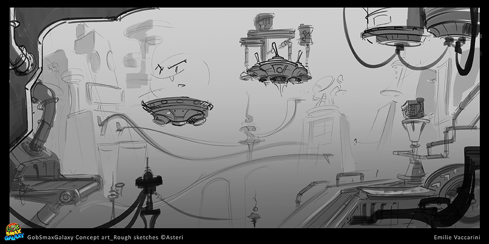
This was her first sketch, way back when we first started:

It was good artwork, and there were elements there that I liked, but it felt tame for a boss battle,
so I asked for another sketch and gave her a lot of reference and a couple mood boards to help her "get there."

Her next sketch was good and very interesting. I liked many parts of it...

but it didn't have the intensity and the drama I was looking for.

I played around with various elements from the PSDs she had sent over
until I got something that really worked for a composition:

I added a little chirascurro, duplicating of pointy things, and all of a sudden, this had all the drama,
danger, and sense of impending doom I was looking for. Emilie and the team loved it.

The next thing was to go to a color comp, but to my delight, Emilie couldn't hold back.
In her excitement, she went directly to full color illustration. This is what she sent: 
Normally, I like color comps because they aren't as time consuming and it's less of a
time sink to iterate, but I was thrilled at what she sent and told her so. Done, or so I thought.

A little time went by and I wondered if the image could be improved a little by tweaking color contrast.

Though slight, I thought it an improvement and presented this to the team. We got a ton of positive feedback.
back to top
|

