Back
A walk-through of the collaborative look-dev process I went through with my artist,
Emilie Vaccarni, for the first stage in the Gobsmax City level progression.
After she absorbed the reference materials I sent,
we discussed the art direction and this task in detail. This was her first sketch:
My feedback in a nutshell: It was very good artwork and conformed to the reference materials,
yet was more blocky, busy, and leaning too much toward steam punk for Gobsmax.

Her next sketch was really, really good...

but it had lost the sweeping lines that I wanted to lead the player's eye,
and was still more blocky than I envisioned. I felt she was nervous and that it was affecting her.
It was our first time working together after all, so I asked her to focus on the boss battle stage
and come back to this later as a way to loosen her up. It worked better than I expected.
Her initial boss battle was more in line for what I wanted for the first stage, so progress!

There were a few elements that I definitely wanted to use from this for the next iteration
of Gobsmax City, so I pointed those out and asked for one more sketch of the first stage.
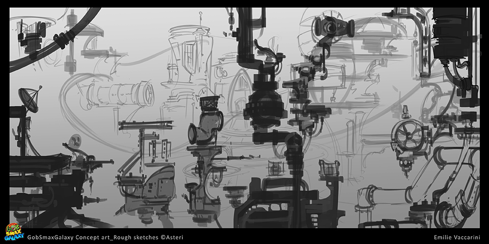
The next iteration was very in-line with what I was looking for, but needed just a little tweaking. 
I took a turn at reworking the image. Paint-over here and there, scaled some items,
and moved things around for composition, then adjusted the values to
strengthen separation of foreground, midground, and background.

I presented this to the team as an AD approved draft and asked for their input.
We got all positive feedback, and so moved to the next phase, color.
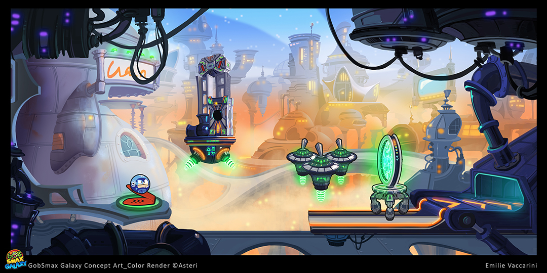
Emilie's first pass on the color comp was really great

I only wanted a couple minor tweaks

and asked her to take a stab at the final draft.
She knocked it out of the park:

I made a few minor tweaks myself and it was all done!
back to top
|